
Kibana and Elasticsearch: See What Tweets Can Say About a Conference
20 Sep 2013In my last post I showed how you can index tweets for an event in Elasticsearch and how to do some simple queries on it using its HTTP API. This week I will show how you can use Kibana 3 to visualize the data and make it explorable without having to learn the Elasticsearch API.
Installing Kibana
Kibana 3 is a pure HTML/JS frontend for Elasticsearch that you can use to build dashboards for your data. We are still working with the example data the is indexed using the Twitter River. It consists of tweets for FrOSCon but can be anything, especially data that contains some kind of timestamp as it's the case for tweets. To install Kibana you can just fetch it from the GitHub repostory (Note: now there are also prepackaged archives available that you can download without cloning the repository):
git clone https://github.com/elasticsearch/kibana.gitYou will now have a folder kibana that contains the html files as well as all the assets needed. The files need to be served by a webserver so you can just copy the folder to the directory e.g. Apache is serving. If you don't have a webserver installed you can simply serve the current directory using python:
python -m SimpleHTTPServer 8080This will make Kibana available at http://localhost:8080/kibana/src. With the default configuration Elasticsearch needs to be running on the same machine as well.
Dashboards
A dashboard in Kibana consists of rows that can contain different panels. Each panel can either display data, control which data is being displayed or both. Panels do not stand on their own; the results that are getting displayed are the same for the whole dashboard. So if you choose something in one panel you will notice that the other panels on the page will also get updated with new values.
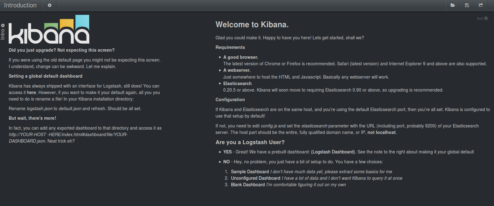
When accessing Kibana you are directed to a welcome page from where you can choose between several dashboard templates. As Kibana is often used for logfile analytics there is an existing dashboard that is preconfigured to work with Logstash data. Another generic dashboard can be used to query some data from the index but we'll use the option "Unconfigured Dashboard" which gives some hints on which panels you might want to have.
This will present you with a dashboard that contains some rows and panels already.
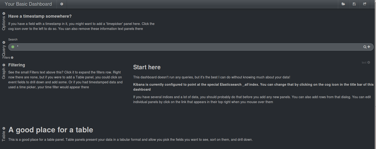
Starting from the top it contains these rows:
- The "Options" row that contains one text panel
- The "Query" row that contains a text query panel
- A hidden "Filter" row that contains a text panel and the filter panel. The row can be toggled visible by clicking on the text Filter on the left.
- The "Graph" row two text panels
- The large "Table" row with one text panel.
Those panels are already laid out in a way that they can display the widgets that are described in the text. We will now add those to get some data from the event tweets.
Building a Dashboard
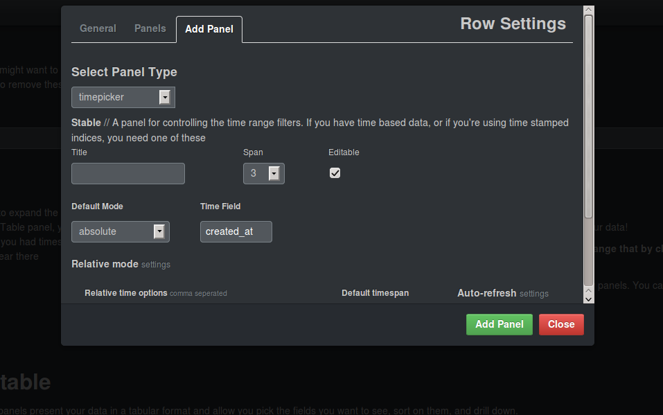
The text panels are only there to guide you when adding the widgets you need and can then be removed. To add or remove panels for a row you can click the little gear next to the title of the row. This will open an options menu. For the top row we are choosing a timepicker panel with a default mode of absolute. This gives you the opportunity to choose a begin and end date for your data. The field that contains the timestamp is called "created_at". After saving you can also remove the text panel on the second tab.
If you now open the "Filters" row you will see that there now is a filter displayed. It is best to keep this row open to see which filters are currently applied. You can remove the text panel in the row.
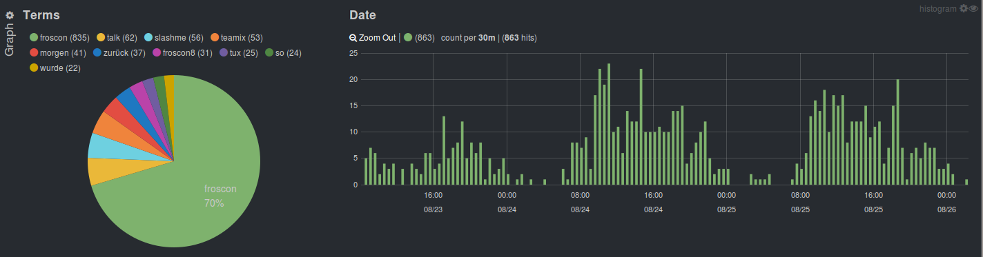
In the graph section we will add two graph panels instead of the text panels: A pie chart that displays the terms of the tweet texts and a date histogram that shows how many tweets there are for a certain time. For the pie chart we use the field "text" and exclude some common terms again. Note that if you are adding terms to the excluded terms when the panel is already created that you need to initiate another query, e.g. by clicking the button in the timepicker. For the date histogram we are again choosing the timestamp field "created_at".

Finally, in the last row we are adding a table to display the resulting tweet documents. Besides adding the columns "text", "user.screen_name" and "created_at" we can leave the settings like it's proposed.

We now have a dashboard to play with the data and see the results immediately. Data can be explored by using any of the displays, you can click in the pie chart to choose a certain term or choose a time range in the date histogram. This makes it really easy to work with the data.
Answering questions
Now we have a visual representation of all the terms and the time of day people are tweeting most. As you can see, people are tweeting slightly more during the beginning of the day.
You can now check for any relevant terms that you might be interested in. For example, let's see when people tweet about beer. As we do have tweets in multiple languages (german, english and people from cologne) we need to add some variation. We can enter the query
text:bier* OR text:beer* OR text:kölschin the query box.
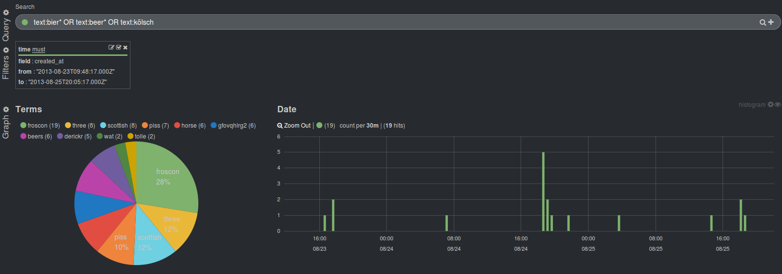
There are only few tweets about it but it will be a total surprise to you that most of the tweets about beer tend to be send later during the day (I won't go into detail why there are so many tweets mentioning the terms horse and piss when talking about Kölsch).
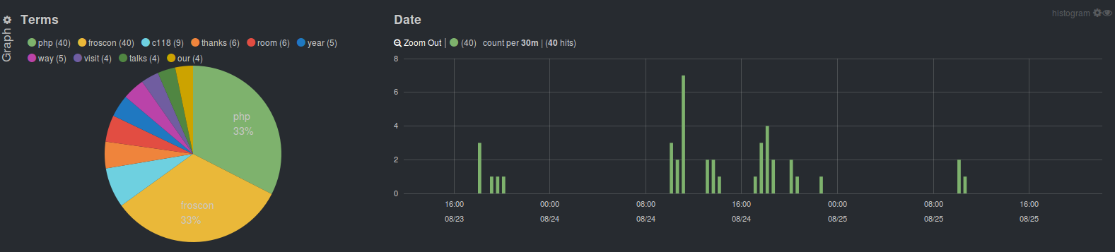
Some more surprising facts: There is not a single tweet mentioning Java but a lot of tweets that mention php, especially during the first day. This day seems to be far more successful for the PHP dev room.
Summary
I hope that I could give you some hints on how powerful Kibana can be when it comes to analytics of data, not only with log data. If you'd like to read another detailed step by step guide on using Kibana to visualize Twitter data have a look at this article by Laurent Broudoux.